3 best online color palette tools: practical systems, extraction, and inspiration
Compare Pocket Palette, Pleezio, and Color Weather for building a usable palette, extracting colors, and finding a creative direction.
Color tools tend to begin in one of three places: a color you already like, an image you need to learn from, or a mood you have not yet translated into swatches. Pocket Palette, Pleezio, and Color Weather each serve one of those starting points.
All three are currently listed on Whimera and open in a browser. We compared their intended workflows on August 11, 2026. This guide does not rank color taste; it helps you choose a useful route from a blank page to a workable palette.
Pick by starting point
| Tool | Start with | Best for | Account |
|---|---|---|---|
| Pocket Palette | One favorite color | Building a compact six-color system | None |
| Pleezio | A color, image, gradient, or contrast question | Moving between several color tasks | None |
| Color Weather | A place, temperature, and weather mood | Finding an expressive four-color direction | None |
Choose Pocket Palette for a small system you can apply immediately, Pleezio when you need a broader color workbench, and Color Weather when inspiration matters more than strict design-system logic.
Pocket Palette: best for turning one color into a usable system
Pocket Palette begins with a single favorite shade and generates a compact six-color palette with tonal variations and copy-ready HEX values. Because the result is intentionally limited, it is easier to answer practical questions: which color can act as the dark anchor, which one supports the background, and which accent should draw attention?
That makes it a useful early-stage tool for a landing page, presentation, personal project, or illustration. It does not pretend to generate a complete semantic design system. The value is a coherent starting point small enough to remember.
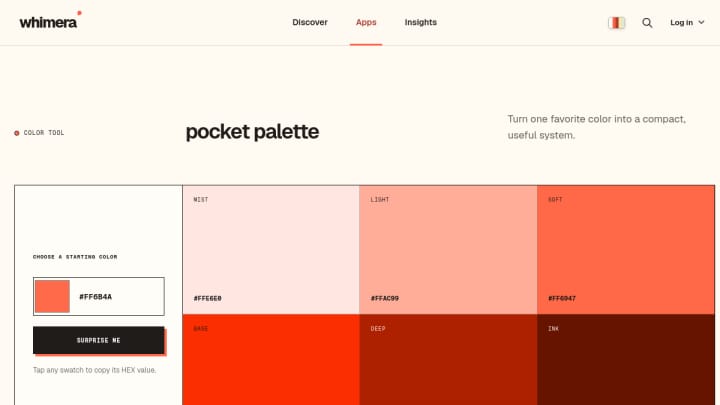
Try this workflow: enter a brand or favorite color, copy the six results, assign rough roles such as background, surface, text, muted text, primary, and accent, then test those roles in the real interface.
Pleezio: best all-purpose color workbench
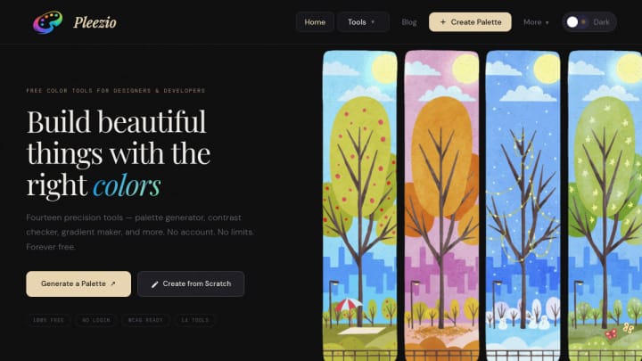
Pleezio combines several related jobs: palette generation, extracting colors from an image, checking contrast, and building gradients. That makes it the best fit here when the work will move between exploration and validation.
The Pleezio website describes a free, no-sign-up browser toolkit. Whimera records local processing for its relevant color and image workflows based on the product’s public information. As always, that field is a documented product characteristic rather than an independent privacy audit.
Use image extraction to understand an existing photograph or visual identity, then use the contrast tool before committing foreground and background pairs. A beautiful palette can still produce unreadable text if luminance relationships are ignored.
Try this workflow: extract candidate colors from a reference image, reduce the selection to a few roles, build one gradient only if the composition needs it, and check the actual text/background combinations.
Color Weather: best for creative prompts
Color Weather is a Whimera-made experiment that translates a chosen weather state and temperature into a four-color story. It does not fetch a live forecast; you supply the place, conditions, and temperature yourself.
The tool is useful when a literal color wheel feels too mechanical. “Rainy and cool” or “sunny and warm” gives you an emotional constraint that can guide an outfit, mood board, illustration, or poster. Each swatch can be copied as a HEX value, so the playful starting point can still move into a real design tool.
Try this workflow: generate two contrasting moods for the same project, capture both palettes, and decide which one better supports the message before refining individual colors.
Palette generation is only the first half
A generated palette is a proposal. Before shipping it:
- Assign roles. Decide which colors are backgrounds, text, borders, actions, and decorative accents.
- Test contrast. Check the exact foreground/background pair at the size and weight you will use.
- Test states. Hover, focus, selected, warning, and disabled states often reveal gaps in a pretty six-swatch set.
- Use real content. A palette that works on a mood board may fail when placed behind long text, charts, or photographs.
- Check more than color. Do not communicate status through hue alone; include labels, icons, patterns, or shape.
A useful three-tool sequence
These apps can also work as a sequence rather than alternatives. Start in Color Weather to find a mood, move one promising shade into Pocket Palette to create a tighter family, then use Pleezio to inspect contrast and explore a gradient or image relationship.
That sequence moves from inspiration to system to validation—the part of color work that generators often collapse into one “magic” result.
Explore Apps by Whimera for Pocket Palette and Color Weather, or visit the Pleezio listing for its catalog facts and public source.